Stroud Community Agriculture Website Redesign
Role: Web designer, Web developer (WordPress), Project coordinator
Project type: Web design & development for Stroud Community Agriculture Ltd.
Project length: 3 months (July-Sept 2022)
Tools: Affinity Designer & Photo, WordPress
Design process: Double Diamond
Stroud Community Agriculture is a community-supported organic/biodynamic farm that is run by and for its members with the aim of building a community around food production.
The project’s objective was to redesign and update the existing website’s content.
Challenge
Solution
The final design is the result of collaboration and work from core group and farm team members, incorporating findings from research and community feedback.
Overview
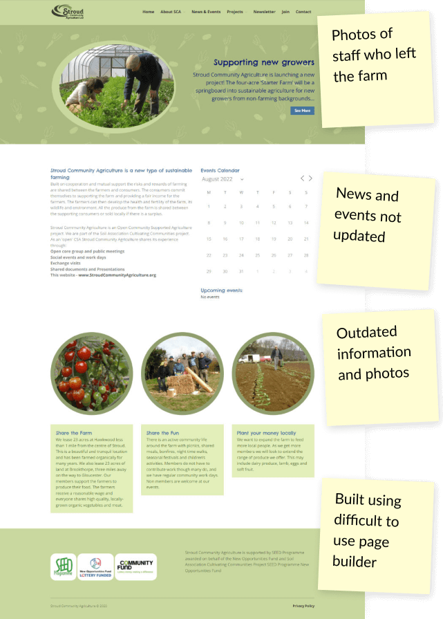
The content has been updated, and a new WordPress theme has replaced the old, difficult-to-use page builder. A streamlined process has been put in place to ensure the website is kept up-to-date.
The site architecture has been revised, archiving pages that no longer serve a purpose (with redirections to avoid broken links), while new pages and features have been added to solve community issues and align with business needs.
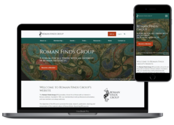
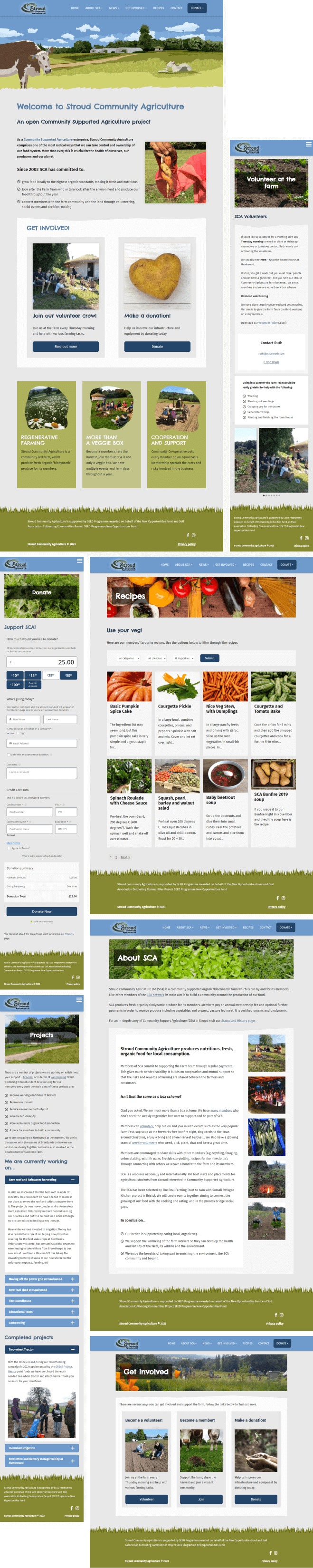
The website is fully responsive, functioning seamlessly across desktop computers, tablets, and mobile devices.
Style guide
I selected a funky, organic Chelsea Market typeface for the headings and a simple and readable Fira Sans for the body text. The colour palette consists of greens and blues – the colours of juicy grass and blue sky complemented by neutral greys.
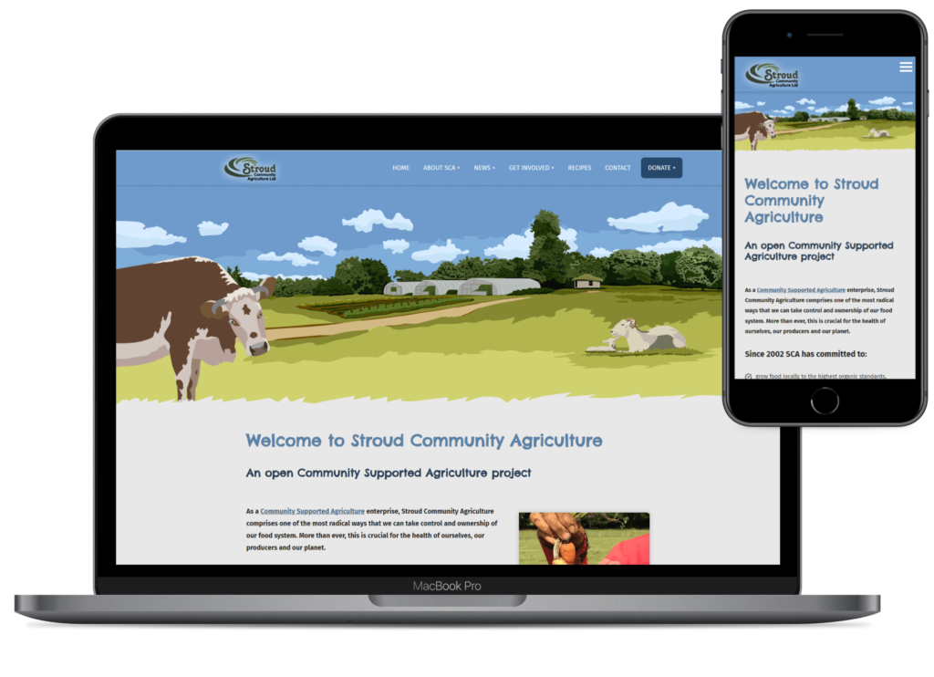
Home page
I replaced the existing image slider with an illustrated banner showing the view of the farm. It sets the tone for the entire site, making it friendly and playful, reflecting the community behind the farm.
Donation page
The farm now has the option to collect donations directly through the website. The donation form is generated using a WordPress plugin and is connected to the organisation’s Stripe account.
Projects page
This webpage lists all current and completed projects cross-linked with the Donation page. Here, users can see how donated money is used, adding to the credibility of the organisation.
Meet the Team page
This page allows users to meet the team who grow their food and appreciate the roles and responsibilities that others have taken on to make the organisation thrive.
Get Involved and Volunteer pages
Two new pages have been created to make it easy for users to find out about volunteering at the farm and other ways to get involved. The Volunteer page has information on volunteering days and details, as well as a list of current seasonal tasks and a gallery of happy volunteers to attract new people.
Recipes
A collection of filterable, vegetable-focused recipes (submitted by the community) that provide SCA members with ideas on how to use their vegetable shares.
My design process
01 Discover
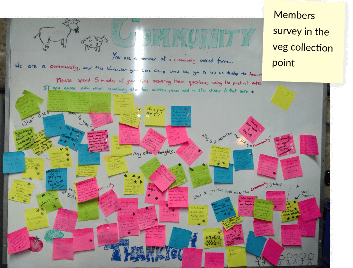
I analysed the existing website and gained feedback from the farm team and the community, which revealed the following findings.
Key weaknesses:
Key strengths:
As an active member of the community and communication admin,
I had insights into the needs and wants of members and farm friends.
I used existing data from the members survey and a SWOT analysis conducted a couple of years back and talked to several members of the community, as well as with core group and farm team members.
Key findings:
Together with a couple of farm team and core group members, we also examined several competitor websites to gain insights into the strategies of successful community-supported farms.
Our goal was to identify the features used by these farms and determine what works and what doesn’t work in terms of user experience.
We later on used these findings to shape the site architecture and make design decisions that would improve the user experience of the SCA website.
02 Define
At this point, I wanted to ensure that everyone involved in the website redesign project was on board with the plan.
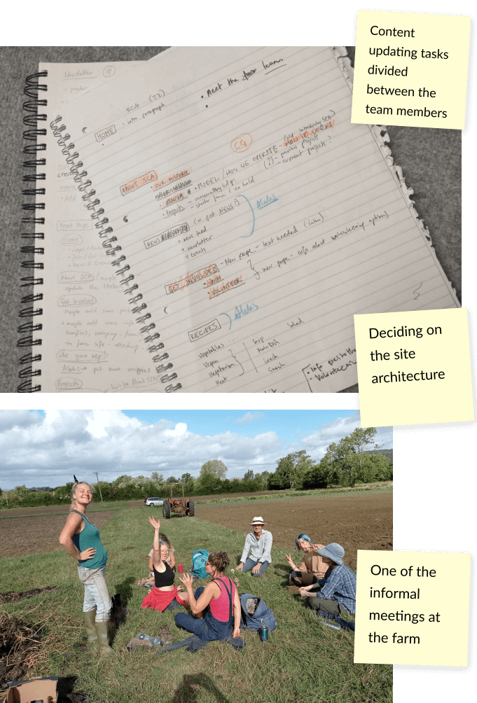
Therefore, I organised a meeting with the core group and farm team members to discuss the research findings and brainstorm potential solutions.
One of the most significant challenges was the outdated content, and we decided to tackle this issue by dividing the task of updating it between the core group and farm team members. We selected a lead QA editor to ensure the content was well-written and consistent.
Additionally, we discussed several ideas to enhance the website, including:
I coordinated the project to ensure smooth operation and alignment among team members. To facilitate collaboration and track progress, I created a project tracker using Google spreadsheets. Tasks were marked as completed once finished.
03 Develop
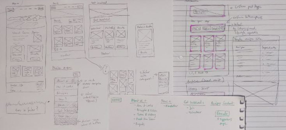
After all the content was finalised, I began designing the required pages and features.
I started with notes and sketches on paper, which gradually evolved into low-fidelity wireframes.
Once I was satisfied with the wireframes, I moved to the digital space and selected appropriate photographs and decided on the general visual feel of the website. Next, I created a simple design system that included the colour scheme, fonts, and elements such as buttons. I also created an illustration for the home page banner.
With these elements in place, I proceeded to work on WordPress on a local server. Using a starter theme, specifically Automattic’s Underscore_s, I created a custom theme that gave me full control over the design. I developed the basic page templates and then used the Gutenberg editor to design the content of each page.
04 Deliver
Once all the pages had been designed, I migrated the website to a hosting server as a staging site in preparation for user testing.
With help of the community we tested multiple user journeys, including donation payment, volunteer opportunities, and vegan recipe searches.
Some visual errors like improper column stacking on mobile and non-functional hover effects were identified. We also discovered opportunities to enhance user experience, such as simplifying the donation form and renaming some menu items for better relevance.
After resolving all identified issues during testing, the website went live. A developer assisted in pushing the staging site live and archiving the old one.
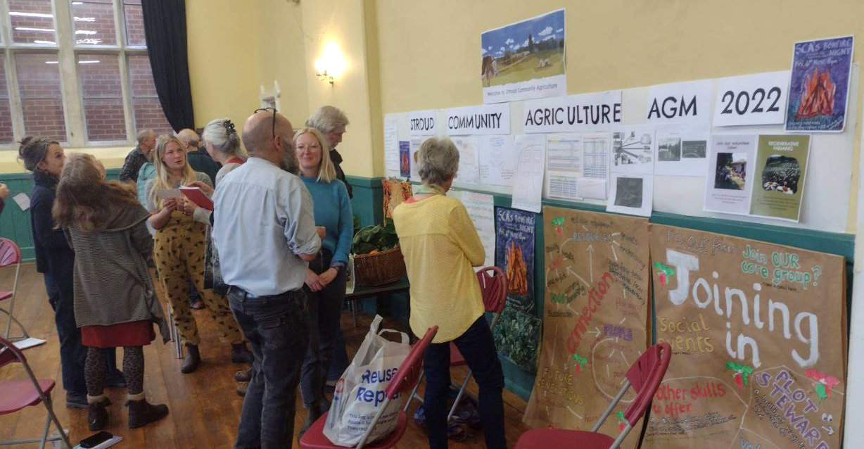
We shared the new website via social media and presented it at the Annual General Meeting, receiving a positive response from the community.
Takeaways
It was a real pleasure to work with such a dedicated team of people and be part of this great community.
It was my first time coordinating a team of such size (9 people), but I found it to be very rewarding, and I was pleasantly surprised by how smoothly everything ran.
It goes to show that with the right people who have the right attitude, projects can be completed efficiently and produce excellent results.