Tanzania Conservation Website
UX/UI design case study
Project type: student project
Role: UX Researcher, UX/UI Designer
Project length: 3 months (January-March 2023)
Tools: Figma (UI design – wireframes and prototypes), Affinity Designer (illustration), Affinity Photo (photo editing), Pen & paper (sketches and wireframes), Miro.com (project board)
Design process: Design Thinking
Tanzania Conservation is a charity that is dedicated to the preservation of the Big Five animals: elephants, lions, leopards, buffaloes, and rhinos.
The project’s goal was to design a new user-centred website that caters to the charity’s growing needs for fundraising, donations, and campaigns.
Challenge & Constraints
Solution
The final design is the result of my research findings and feedback from peers and tutors throughout the course.
This UX/UI design case study showcases my design process and rationale behind the design.
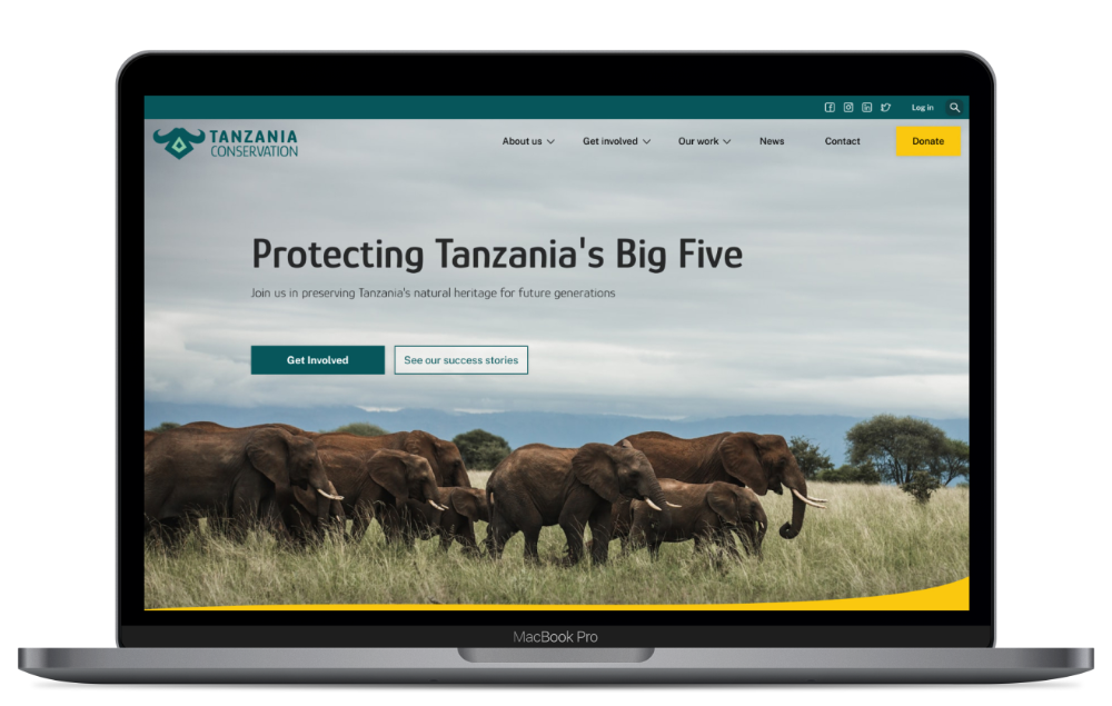
Visual website
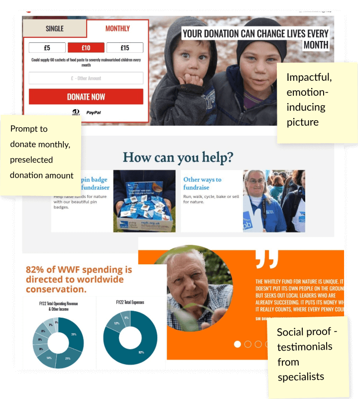
My design incorporates striking images and two bold colours – teal/green and yellow – that bring the big five to life. The prominent donation button, with its high colour contrast, is hard to miss, and it will hopefully help the charity achieve its goal of increasing yearly turnover.
Home page
The structure of the home page takes the user on a journey of exploring the charity’s activities and highlighting its success stories, while also prompting the user to get involved and help the organization.
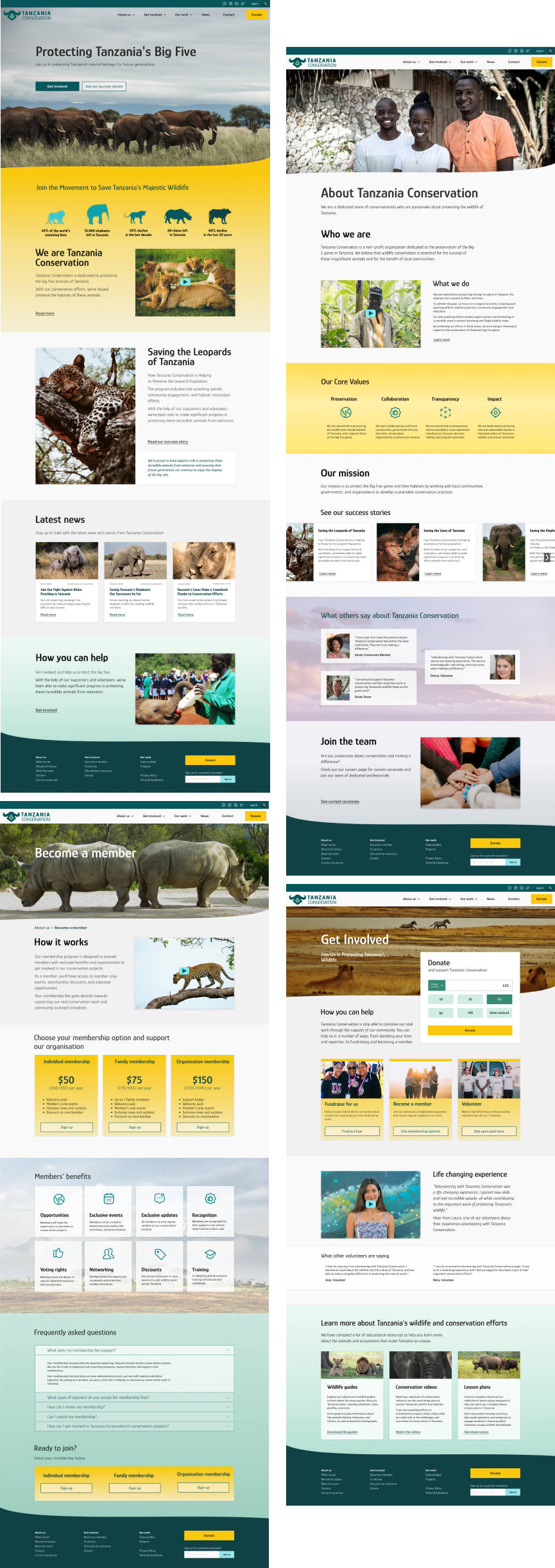
About us
On this page, the user can find important information about the charity. Transparency was a significant issue raised in the user research, so the charity’s core values and mission are highlighted, along with testimonials from the community and volunteers.
Getting Involved
For every organization that relies on donations, it is important to have multiple streams of income. Visitors to Tanzania Conservation have multiple ways to support the organization. They can fundraise, become a member, volunteer, or simply donate. If a user chooses to become a member, they have three membership options to choose from, with multiple benefits to keep them engaged.
My design process
01 Empathise
I began my research by analysing the websites of five competitors, with a focus on their features, design, and user experience.
Key weaknesses:
Key strengths:
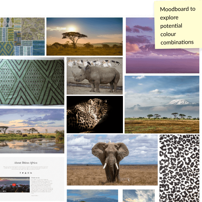
I created a project mood board, and conducted user research what gave me valuable insights into the target audience’s needs and preferences.
Key findings:
02 Define
Based on the design brief and preliminary research, I have formulated the main problem statement:
Tanzania Conservation is facing challenges in meeting its growing fundraising and marketing goals due to an outdated website.
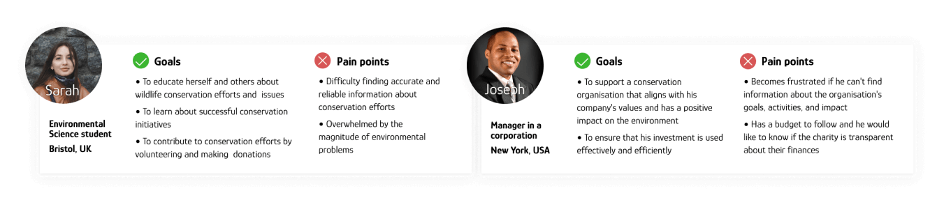
Based on the user research conducted, I have created personas that reflect typical users of the Tanzania Conservation website.
03 Ideate
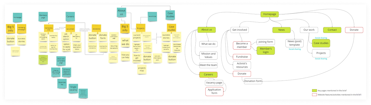
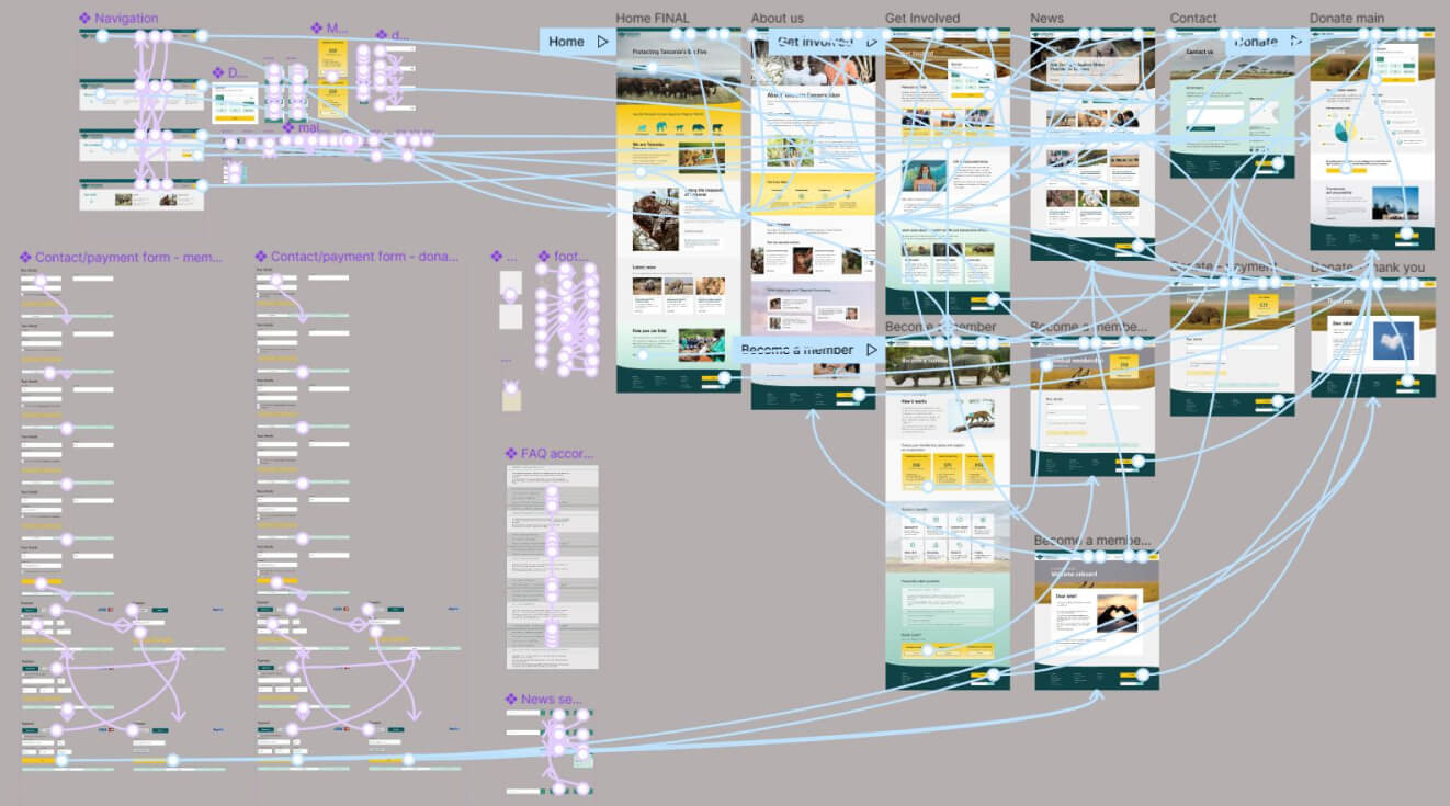
Based on the research, brief, and charity’s needs, as well as taking into account common web patterns, I defined the website’s architecture.
I used a Miro board and digital sticky notes to capture my initial ideas, and then narrowed down to the key pages and features.
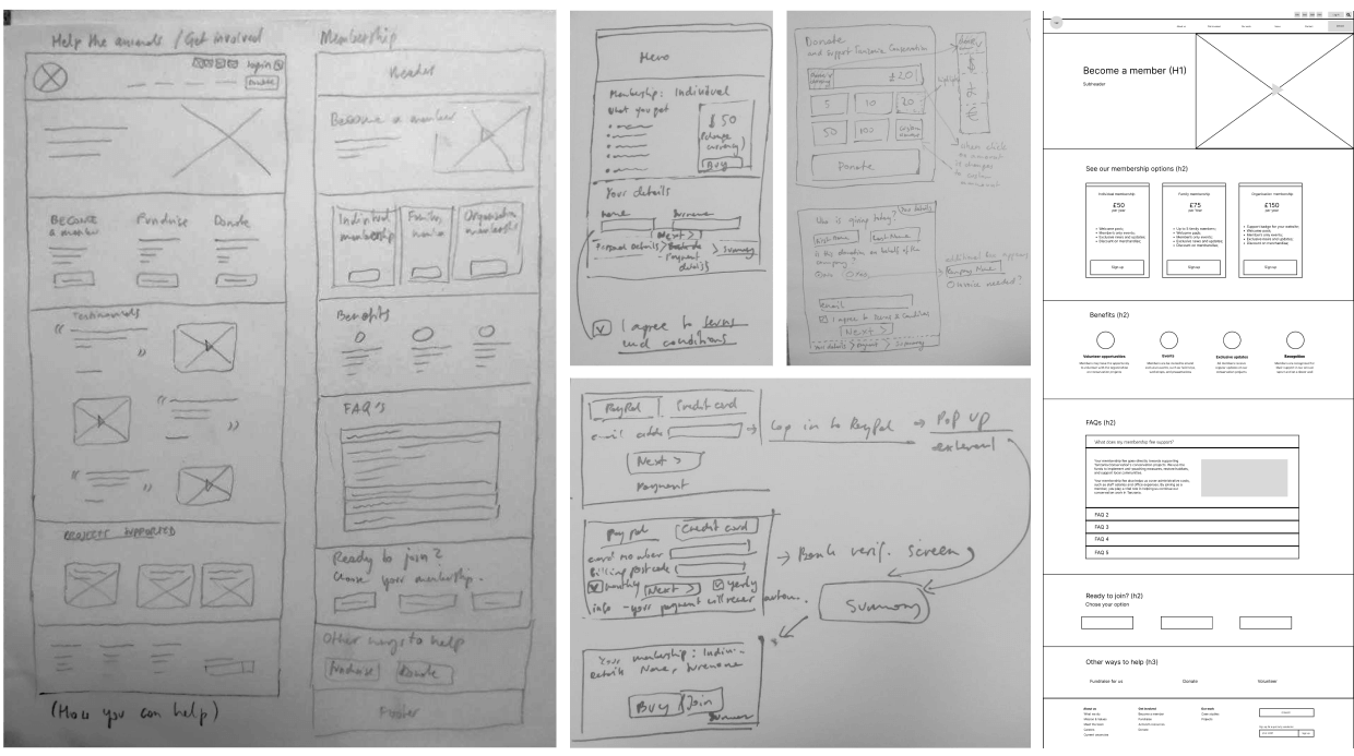
I sketched low-fidelity wireframes on paper and then transferred them to Figma for digital design. I iterated multiple times, exploring different layouts and user flows.
04 Prototype
I developed a concise design system that included typography, colours, and other design elements.
For my final prototype, I made use of Figma’s helpful features, such as Styles and Components, to ensure a consistent and streamlined design.
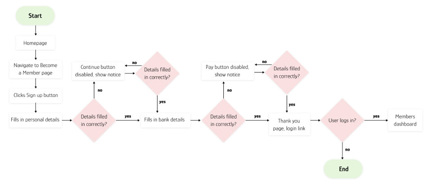
05 Test
I tested my solution with giving users three tasks and observing their interactions with the website.
The tasks were:
Takeaways
I thoroughly enjoyed working on this bootcamp project and am pleased with the solution I designed, despite the fact that it still needs some work before being turned into a real website.
This was the first time I conducted such extensive research before creating any visual design, and the biggest lesson I learned was that designing based on real data and user needs makes sense and is worth taking the extra step for the benefit of the project.
In the future, I would like to invest more time in user testing and explore different user journeys and flows.
I hope you enjoyed reading about my design process in this UX/UI design case study. If so, check out the story of building the Stroud Community Agriculture website.